

Website Redesign
On February 1, visitors using smartphones and tablets will see a remarkable improvement to our website. If you are using a desktop computer, you will not see much difference.

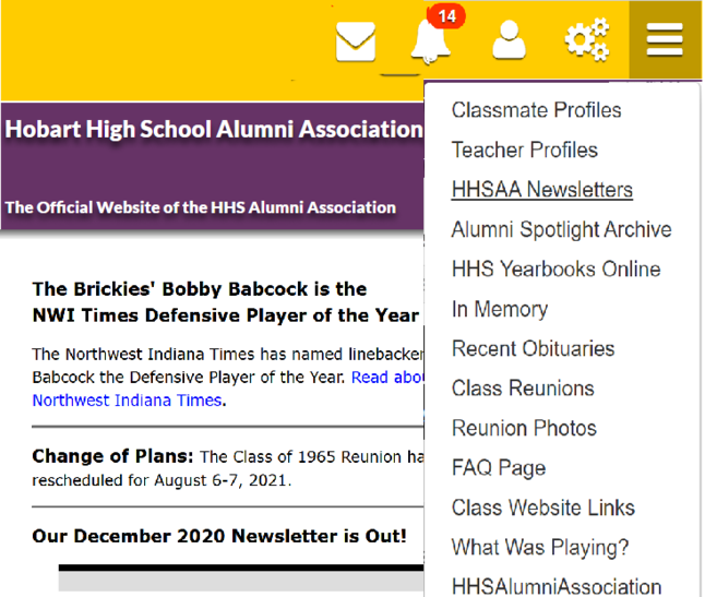
Pages will be much easier to read on smartphones and tablets. Instead of the menu taking up space, you will see a menu icon in the upper right part of the screen, which will bring up the menu when you tap it.
For desktop users, you will see some links across the top, and the rest on the left side, as they are now.
Here are some sample screen shots.
DESKTOP:

TABLET:


SMARTPHONE:

The concept is called "responsive design". The web page responds to the size of the device it is being displayed on. We hope that you will find visiting the site to be a much more pleasant experience.